Difference between revisions of "AGIWiki/Picedit Tutorial 1"
m (moved AGIWiki/Picedit Tutorial 2 to AGIWiki/Picedit Tutorial 1 over redirect) |
m |
||
| (One intermediate revision by one other user not shown) | |||
| Line 1: | Line 1: | ||
{{AGIWiki}} | {{AGIWiki}} | ||
''This article, originally by [[Kon-Tiki]]'' | <center>'''[[AGIWiki/Tutorials and Guides|Tutorials and Guides]]'''</center> | ||
''This article, originally by [[AGIWiki/Kon-Tiki|Kon-Tiki]]'' | |||
== Setting up the Picture == | == Setting up the Picture == | ||
| Line 7: | Line 9: | ||
=== Plan the composition === | === Plan the composition === | ||
{| | {| width = "100%" | ||
| | | | ||
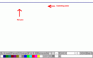
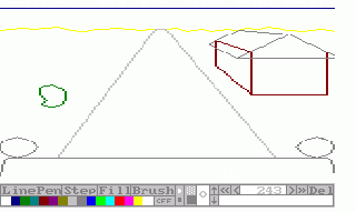
First thing you should do is find out what should be on your picture. What should be in the background, what in the foreground, etc. Then comes the first thing you do in Picedit (except for opening it and starting a new pic) is setting the horizon. Draw the line where the horizon should be and remember the Y- coordinate. Then set the vanishing point. The vanishing point is the place where everything tends to disappear in if you draw the lines far enough. | First thing you should do is find out what should be on your picture. What should be in the background, what in the foreground, etc. Then comes the first thing you do in Picedit (except for opening it and starting a new pic) is setting the horizon. Draw the line where the horizon should be and remember the Y- coordinate. Then set the vanishing point. The vanishing point is the place where everything tends to disappear in if you draw the lines far enough. | ||
| Line 16: | Line 18: | ||
* The higher the vanishing point, the lower you're standing. | * The higher the vanishing point, the lower you're standing. | ||
| | | | ||
[[Image:Picedit tutorial 1.gif|320px|Click to enlarge.]] | <div align = "right">[[Image:Picedit tutorial 1.gif|320px|Click to enlarge.]]</div> | ||
|} | |} | ||
=== Setting up the composition === | === Setting up the composition === | ||
{| | {| width = "100%" | ||
| | | | ||
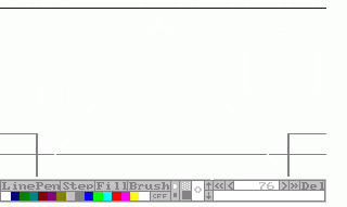
Second thing that needs to be done, is setting up the composition. Draw boxes where you want everything to be. | Second thing that needs to be done, is setting up the composition. Draw boxes where you want everything to be. | ||
| Line 30: | Line 32: | ||
* Try to keep the coordinates and priority lines in mind. | * Try to keep the coordinates and priority lines in mind. | ||
| | | | ||
[[Image:Picedit tutorial 2.gif|320px]] | <div align = "right">[[Image:Picedit tutorial 2.gif|320px]]</div> | ||
|} | |} | ||
=== Setting the perspective === | === Setting the perspective === | ||
{| | {| width = "100%" | ||
| | | | ||
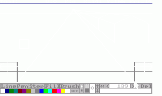
This's easy and done really fast. Just draw lines from the corners of the boxes that aren't round surfaces. Make sure not to draw the line that runs through the box, unless the object in it will be transparant. When that's done, draw the lines where the object should stop. Make sure that these lines run exactly the same as the lines a bit further on (like the roof in the example). | This's easy and done really fast. Just draw lines from the corners of the boxes that aren't round surfaces. Make sure not to draw the line that runs through the box, unless the object in it will be transparant. When that's done, draw the lines where the object should stop. Make sure that these lines run exactly the same as the lines a bit further on (like the roof in the example). | ||
| Line 43: | Line 45: | ||
* To draw halve/full circles, draw a cross in the middle of the box and draw curves from one point of it to the next using the pen tool. This's a bit tricky and demands lots of exercise. The main idea is to mirror the pixels over the line of the cross. | * To draw halve/full circles, draw a cross in the middle of the box and draw curves from one point of it to the next using the pen tool. This's a bit tricky and demands lots of exercise. The main idea is to mirror the pixels over the line of the cross. | ||
| | | | ||
[[Image:Picedit tutorial 3.gif|320px|]] | <div align = "right">[[Image:Picedit tutorial 3.gif|320px|]]</div> | ||
|} | |} | ||
| Line 50: | Line 52: | ||
=== Drawing the outlines === | === Drawing the outlines === | ||
{| | {| width = "100%" | ||
| | | | ||
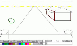
Now the time's come to draw the actual picture. Draw the lines according to the frame you've set up. Choose the colour you want and don't mind the priorities yet. If you have some curved lines, draw them according to the lines you've set up, but you can stray a bit off. Remember: those black lines're just guidelines. Be sure to draw every line. If a line should be black, draw over it. | Now the time's come to draw the actual picture. Draw the lines according to the frame you've set up. Choose the colour you want and don't mind the priorities yet. If you have some curved lines, draw them according to the lines you've set up, but you can stray a bit off. Remember: those black lines're just guidelines. Be sure to draw every line. If a line should be black, draw over it. | ||
| Line 59: | Line 61: | ||
* To change the colour of a half/full circle, go back into the history and change it. | * To change the colour of a half/full circle, go back into the history and change it. | ||
| | | | ||
[[Image:Picedit_tutorial_4.gif|320px|]] | <div align = "right">[[Image:Picedit_tutorial_4.gif|320px|]]</div> | ||
|} | |} | ||
=== Removing the frame === | === Removing the frame === | ||
{| | {| width = "100%" | ||
| | | | ||
It's best you get rid of those ugly black lines now. Go to the beginning of the history (press 'HOME') and delete (press 'DEL') everything until only the colours remain. | It's best you get rid of those ugly black lines now. Go to the beginning of the history (press 'HOME') and delete (press 'DEL') everything until only the colours remain. | ||
| Line 74: | Line 76: | ||
* Be aware if you've changed colours by using the history (f.e. for circles) that you don't delete them too. | * Be aware if you've changed colours by using the history (f.e. for circles) that you don't delete them too. | ||
| | | | ||
[[Image:Picedit tutorial 5.gif|320px|]] | <div align = "right">[[Image:Picedit tutorial 5.gif|320px|]]</div> | ||
|} | |} | ||
=== Adding a Sierra-touch === | === Adding a Sierra-touch === | ||
{| | {| width = "100%" | ||
| | | | ||
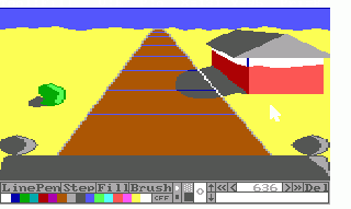
This's the moment we've all been waiting for. You're going to add the 'Sierra-touch'. The trick is to use the darker or lighter version of a colour. Draw it a bit from the border and make it a whole. Fill it, then fill the rest. It's as simple as that. Same thing's for shading, but the border colour should be the colour of the shade then and the relief in the shaded part should have the darker version of the not-shaded colour. | This's the moment we've all been waiting for. You're going to add the 'Sierra-touch'. The trick is to use the darker or lighter version of a colour. Draw it a bit from the border and make it a whole. Fill it, then fill the rest. It's as simple as that. Same thing's for shading, but the border colour should be the colour of the shade then and the relief in the shaded part should have the darker version of the not-shaded colour. | ||
| Line 89: | Line 91: | ||
* Now it's a good time to save the pic. | * Now it's a good time to save the pic. | ||
| | | | ||
[[Image:Picedit_tutorial_6.gif|320px|]] | <div align = "right">[[Image:Picedit_tutorial_6.gif|320px|]]</div> | ||
|} | |} | ||
Latest revision as of 13:30, 28 January 2015
This article, originally by Kon-Tiki
Setting up the Picture
Plan the composition
|
First thing you should do is find out what should be on your picture. What should be in the background, what in the foreground, etc. Then comes the first thing you do in Picedit (except for opening it and starting a new pic) is setting the horizon. Draw the line where the horizon should be and remember the Y- coordinate. Then set the vanishing point. The vanishing point is the place where everything tends to disappear in if you draw the lines far enough. Some tips
|
Setting up the composition
|
Second thing that needs to be done, is setting up the composition. Draw boxes where you want everything to be. Some tips
|
Setting the perspective
|
This's easy and done really fast. Just draw lines from the corners of the boxes that aren't round surfaces. Make sure not to draw the line that runs through the box, unless the object in it will be transparant. When that's done, draw the lines where the object should stop. Make sure that these lines run exactly the same as the lines a bit further on (like the roof in the example). Some tips
|
The actual picture
Drawing the outlines
|
Now the time's come to draw the actual picture. Draw the lines according to the frame you've set up. Choose the colour you want and don't mind the priorities yet. If you have some curved lines, draw them according to the lines you've set up, but you can stray a bit off. Remember: those black lines're just guidelines. Be sure to draw every line. If a line should be black, draw over it. Some tips
|
Removing the frame
|
It's best you get rid of those ugly black lines now. Go to the beginning of the history (press 'HOME') and delete (press 'DEL') everything until only the colours remain. Some tips
|
Adding a Sierra-touch
|
This's the moment we've all been waiting for. You're going to add the 'Sierra-touch'. The trick is to use the darker or lighter version of a colour. Draw it a bit from the border and make it a whole. Fill it, then fill the rest. It's as simple as that. Same thing's for shading, but the border colour should be the colour of the shade then and the relief in the shaded part should have the darker version of the not-shaded colour. Some tips
|
Adding the priorities
Now go through the history and add the priorities to the drawing actions of the other parts. This way, you'll save a lot of time you'd waste by tracing. It's also far more accurate.
Some tips
- Try to find the best action to add a certain priority action to.
End result
You can add more details than this in this picture. That's all up to your imagination.
